Own product · 2026
TickMedic
My own tick-removal kit brand. I designed and built its store from scratch, from the first mockup to checkout. The first run sold out.
Outcome
The first run sold out, so the store now waits behind a sign-up page that collects emails for the restock.
- Challenge
- Lyme is easy to overlook. I wanted simple tick kits people keep on hand, sold through a store I designed and built.
- What I built
- A calm store for a worrying topic: a step-by-step kit walkthrough, honest promotions, and a checkout where each payment becomes one order.
01 / 08
Why TickMedic Exists
A lupus diagnosis changed how I see small risks. Lyme disease is one I could do something about.
A few years ago I was diagnosed with lupus, an autoimmune condition. I'd grown up athletic and rarely had to think about my health.
Suddenly I thought about it every day. It showed me how fast things can shift, and why small risks deserve attention early.
Lyme disease is one of those risks. Most people don't think about it until it reaches them or someone they know.
So I made a tick-removal kit that's simple and easy to keep on hand: on the trail, at the cottage, walking the dog.
“It is a small thing to have with you. But sometimes, small things matter.”
I skipped Shopify and designed and built the store myself, from the first mockup to checkout.
02 / 08
Designing for a Stressful Moment
People shopping for this are often worried. The design's first job was to make the topic feel calm.
My first spec set the tone before any page: take the anxiety out of ticks and Lyme. Friendly, not clinical.
Two kinds of visitor arrive. People from search or ads need trust and education; returning shoppers need details and a quick add to cart.
Real situations organise the store: camping, golf, pets, hiking and the outdoors. Each has an icon and a place, so people see themselves fast.
Urgency had to be about health, not sales. Instead of a countdown timer, one band explains how much time you have.
The use cases come first, drawn from the kit's own packaging icons.
The only urgency on the page is the medical kind.
03 / 08
From Mockup to Brand
I designed the homepage first, then rebuilt it four days later around the real packaging.
On June 4 I approved a homepage mockup before building anything. It used a serif display face and a forest‑and‑sage palette.
On June 8 I rebuilt it around the pouch itself: its green, its gold, its icons. The site now matches the product in your hand.
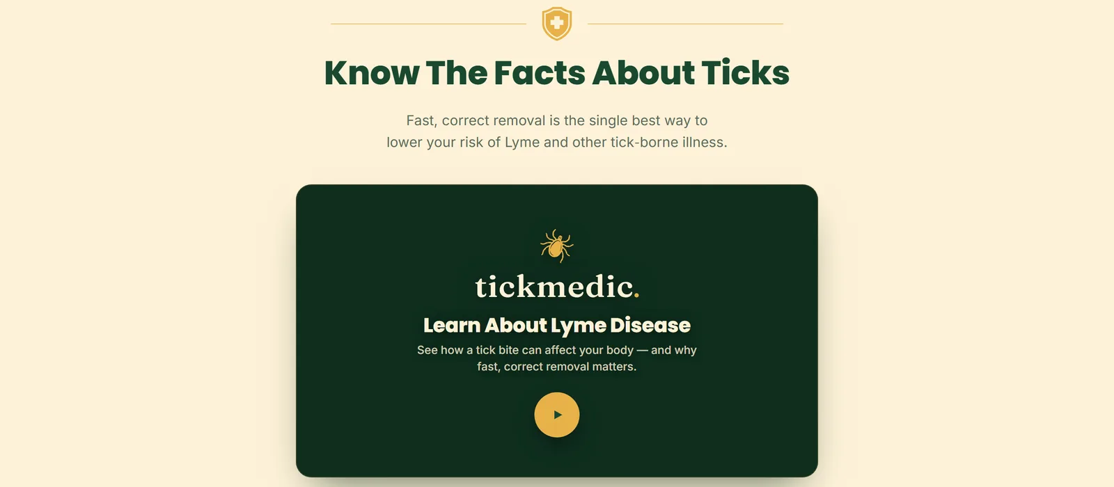
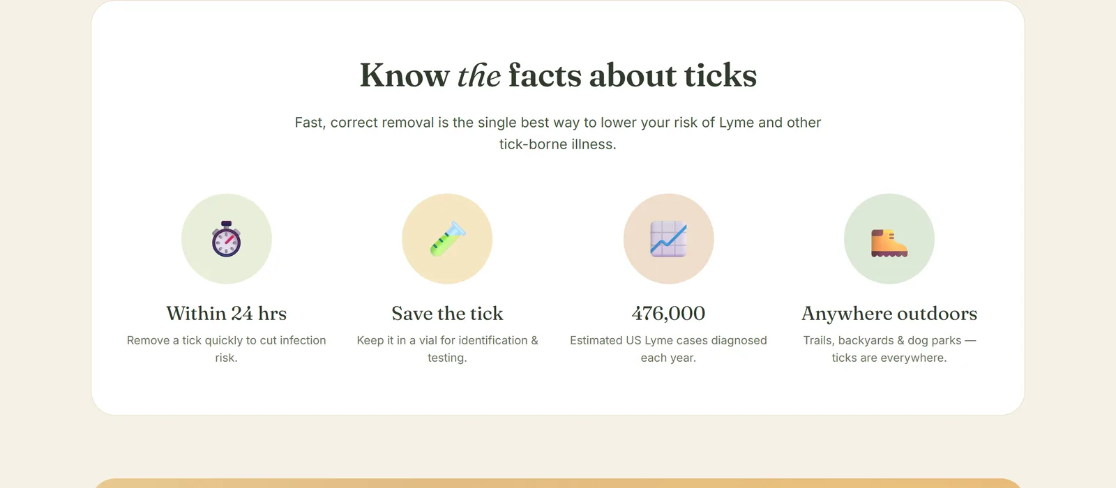
The system is small on purpose: six colours, three typefaces, and terracotta saved for urgency alone.
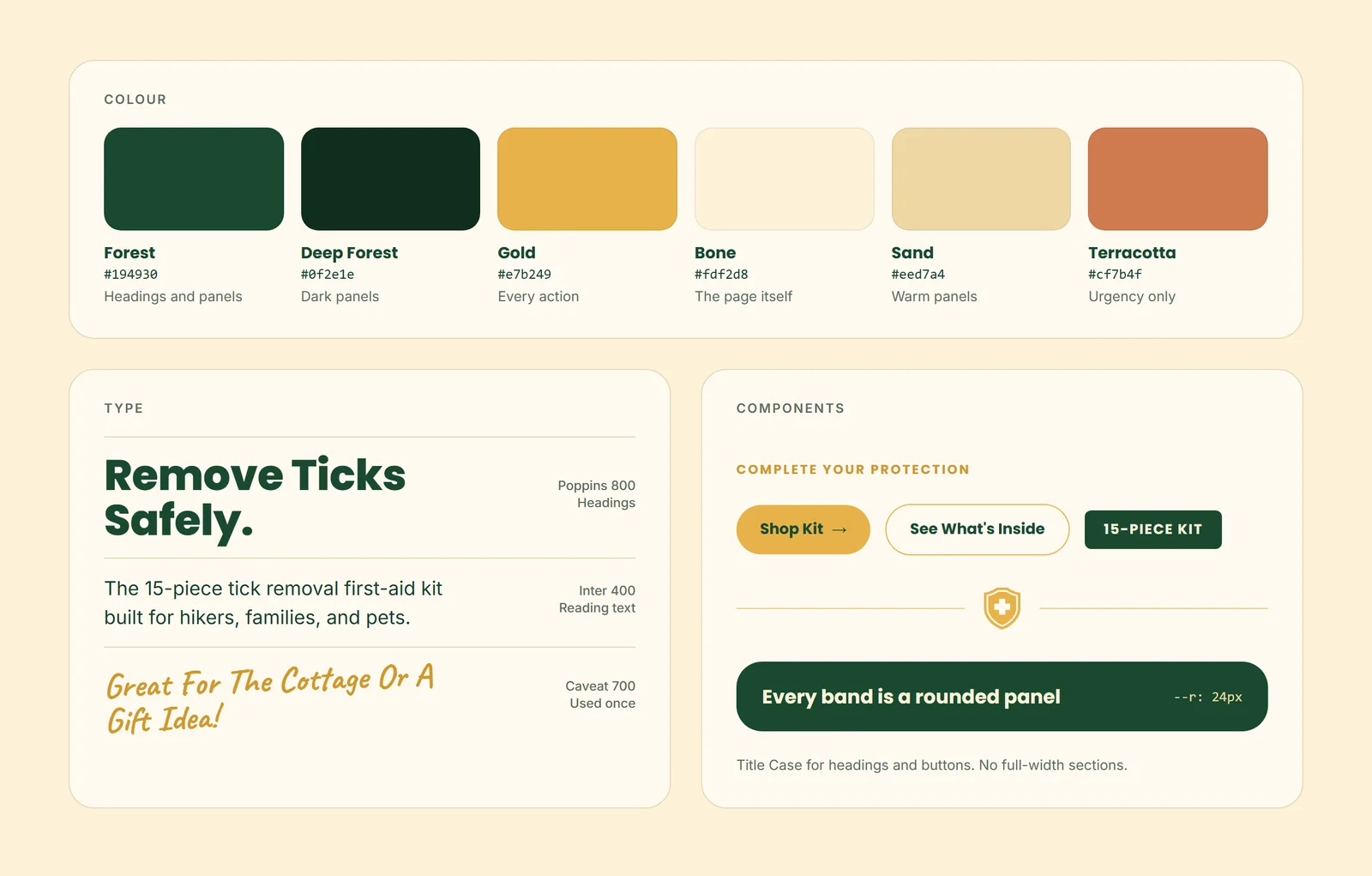
I also ruled out full-width sections across the whole site. Every band became a rounded panel with room around it.
04 / 08
Five Rounds on the Walkthrough
Showing what's in the kit, step by step, took five rounds. Each began with naming what was wrong with the last.
My first version pinned the section while you scrolled. Each step felt like one small image floating in a dark void.
A side-by-side layout came next and went. Then I called the boxed tiles an eyesore and replaced them with flat chips.
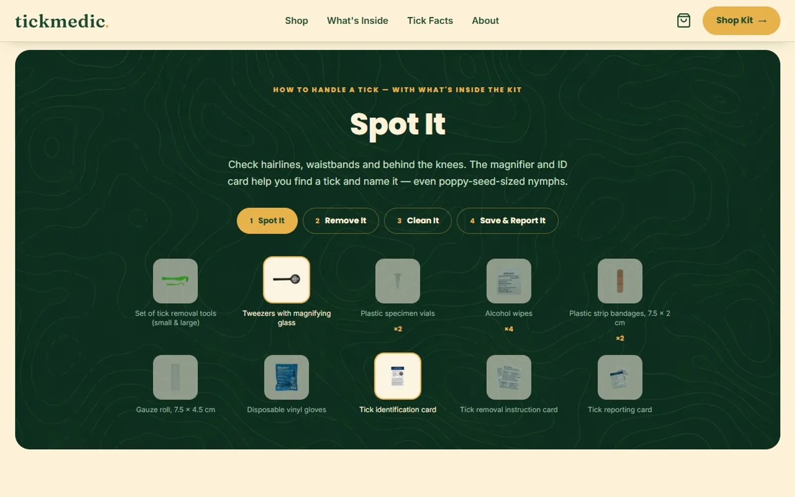
Four tabs walk through handling a tick, step by step.
Each step lights up the pieces it needs.
The rest dim to 55%, so they stay readable.
On a phone, the tabs wrap to two rows.
And the pieces stack two to a row.
Pieces outside the current step dim to 55%. Fading them further looked like broken UI, not a choice.
On product pages, the same contents became quiet thumbnail rows. Their job is reassurance, not a second place to shop.

A card grid looked the most shoppable, and that was the problem. It would have competed with the buy box above it.
What's Inside: every piece in a quiet row, with its quantity.
How It Works: three steps on the same dashed trail as the use cases.
05 / 08
Selling Without Pressure
Every nudge had to be honest: a gift you can actually see, and a bundle that doesn't lean on per‑kit maths.
The cart first promised a "Free Gift" without saying what it was. A reward you can't picture doesn't pull anyone forward.
So I named it, a repellent spray, and showed its value. That value comes from the spray's own price, so they can never disagree.
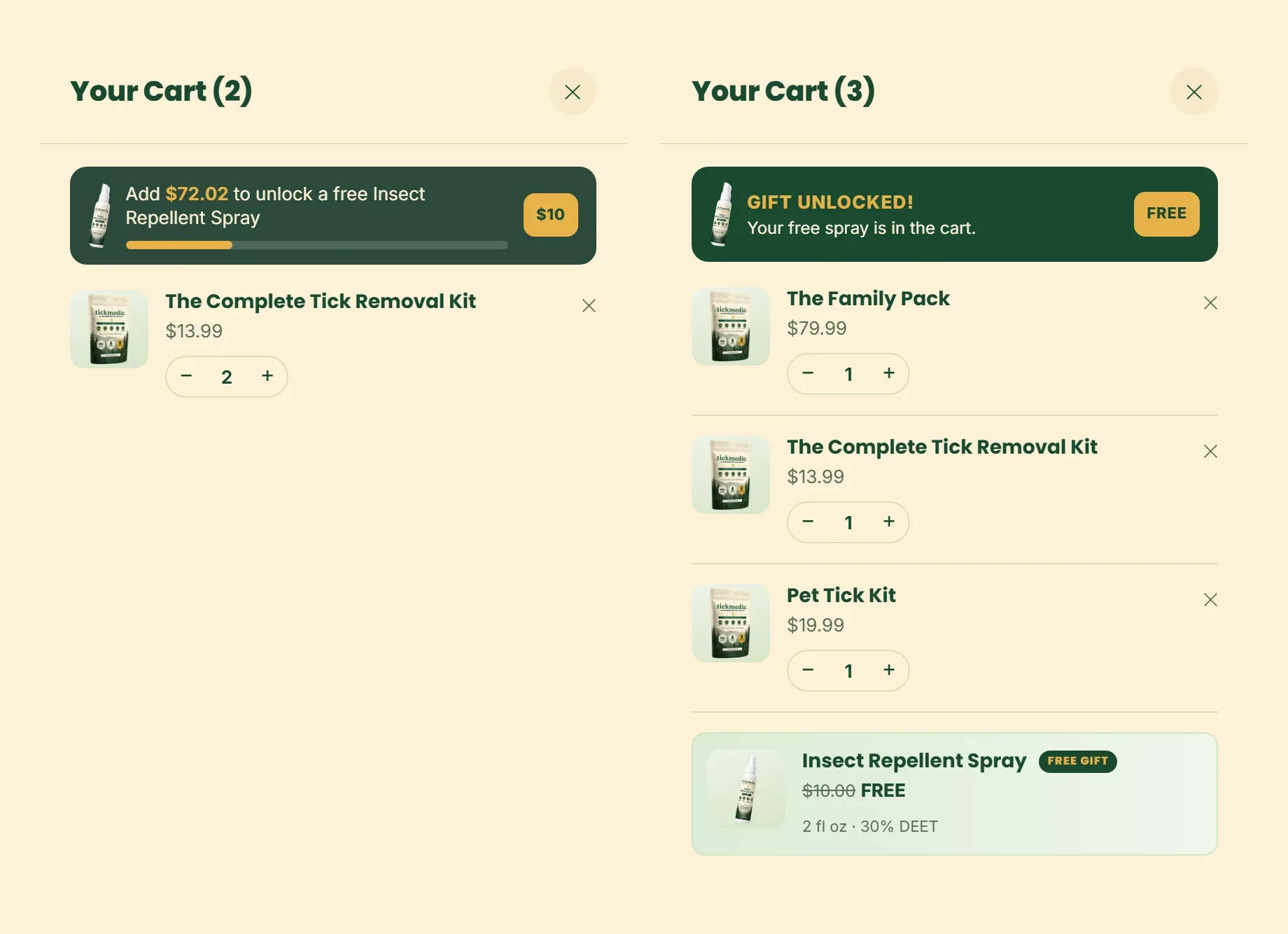
The browser can't claim the gift. The server recomputes the total and adds the spray only if it's really in stock.
Once it's unlocked, the paid spray drops out of the recommendations. Offering it next to a free one read oddly.
For the four-kit Family Pack, I kept per-kit maths off the page. At about $20 a kit, it would lose to a $13.99 single.
It sells on coverage instead: one for the car, the daypack, the cabin and the dog bag.
Scarcity only appears when it's real. A low-stock badge reads live stock, and there are no countdown timers.
06 / 08
Four Versions of the Shop
The shop page taught me the most, because the version I had to argue against was my own.
It began as the homepage's buy box on its own page. That felt like one product's detail page, not a shop.
Version two added a featured card above a grid. Version three became a full conversion page with a rewards ladder and cross‑sells.
Three days later I critiqued it. The spotlight and the grid showed the same two kits, which made the page feel unsure of itself.
Eight stacked bands had no spine, and the catalog sat fifth on the page.
Version four put the catalog first. The flagship appears once, as a large card inside the grid, and a test keeps it that way.
07 / 08
Under the Hood
I built the store too, so the first order would be right with nobody watching, and every visitor could use it.
Before I drew a page, I decided who owns what. Code owns each kit, the database owns stock and orders, Stripe owns the money.
The catalog lives in a database, so copy and prices change without a redeploy. A script keeps Stripe's prices in step.
Stripe can report the same payment twice. The store records the order either way, but only takes stock the first time.
If stock would go below zero, the order is still kept and flagged for me. A paying customer is never silently dropped.
The same care went into access. Every animation respects reduced-motion settings, and nobody gets a half-hidden page without JavaScript.
Kit tooltips open on hover, keyboard focus or tap. The walkthrough is a real set of tabs, announced as tabs.
The cart is a proper dialog that closes on Escape. The free spray's price is read aloud as its retail value, now free.
The sticky add-to-cart bar stays out of screen readers and tab order while it's off screen.
08 / 08
Where It Stands
The first run sold out. The store waits behind a sign-up page until the restock arrives.
On June 25 I put up a holding page in front of the store. One setting switches every page to it.
The first run of kits has since sold out. Until the restock lands, the page collects emails from people who want one.
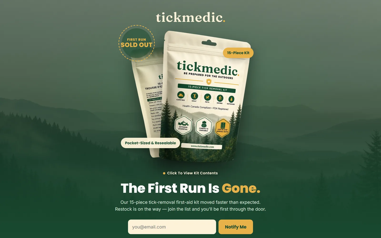
When stock returns, reopening the store is the same single setting.
The habit I'd keep is writing down why before drawing. Short specs turned reactions like "eyesore" into decisions I could check later.
Next case study
Prospector →
Finding local businesses worth pitching took hours of manual site audits.